Rebranding 3D Studio
One team, two design studios, and almost 8760 hours of work
3D Studio is a classic success story. Starting as a small business in 2011, it grew into a multinational company with over a thousand full-time specialists worldwide. As of 2022, the company provides a full range of complex solutions for game development (including art direction, 3D character and environment design, animation, VFX, and trailer production) for clients like Ubisoft, EA, Xbox Game Studios, Activision, 505Games, Square Enix and Gameloft.
Naturally, the company has changed in many ways, adjusting business models, service lines, marketing, HR, sales, etc. This considerable growth demanded a reevaluation of how 3D Studio should look in the eyes of its clients and teams. The brand image needed to match the company’s current stature, expertise, and position on the market.
The 3D Studios marketing team took it upon themselves to carry on the rebranding initiative. This article describes the result of a nearly one-year work and the efforts of the 3D Studio marketing team, TWID Creative Studio, and snig.digital to bring this ambitious project to life.
Our vision
In retrospect, the company’s identity wasn’t given enough attention that it rightfully deserved. At times, the company focused on growth, and branding wasn’t the main priority, quite frankly. Tables turned when it became apparent that the branding initiative couldn’t be sidestepped any longer. So the 3D Studios marketing team started laying out the roadmap for the rebranding initiative.
When the team started approaching the rebranding initiative, we came to realize the responsibility behind that decision. The company’s immense growth since its establishment in 2011 allowed us to transform into one of the most broad-spectrum studios on the market—working in basically all genres of visual art. The gaming industry’s evolution through the years was also apparent, and we had to keep up and continue setting trends.
The modern brand has to be a precise combination of boldness, contemporary visual approaches, and consistency. So, with all these features and the Studio’s background in mind, the marketing team began exploring rebranding opportunities. With the fantastic roster of clients already working with 3D Studio, the biggest challenge was to create a brand identity that would be both familiar and appealing to the new partners.
Maria Dziubina, Head of Marketing at 3D Studios Group
The team started with accessing the current situation. After extensive research, they identified that there wasn’t the right design system and guidelines to meet all the required objectives. 3D Studios corporate website included various sections (portfolio, blog, employer brand, etc.) managed by different departments. That resulted in inconsistent usage of main style-forming elements.
The old 3D Studio website had significant limitations. It failed to provide accurate service descriptions and also present a portfolio to prospective clients cohesively and conveniently; secondly, it missed the necessary content and functionality for the job applicants (employer brand loyalty programs). That was a clear indication that it had to be redone from scratch.
Creating a new visual identity
The marketing team needed a multipurpose design system that would give a consistent brand representation across the entirety of the website. But to do so, they had to start with some of the most essential visual identity elements. To deliver this ambitious project, the marketing team of 3D Studio reached out to TWID creative studio for their expertise.
Logo redesign
Logo redesign typically involves soul searching to uncover the inner “why.” However, that wasn’t exactly the case with 3D Studio: the team was already well aware of what kind of message they wanted to convey behind the brand image. The real issue was the visual representation.
Our approach to logo redesign was purely functional-based. To put it simply, we needed something that would look great with our portfolio, client presentations, and even gifts. At the same time, we wanted a logo that naturally blends in different environments while staying true to its character.
Maikl Babenko, 3D Studio brand manager
Creating just “a functional logo” might seem easy at first glance, but that couldn’t be further from the truth, particularly in the case of 3D Studio. The company’s portfolio alone includes a tremendous amount of artwork of all different styles that needs somehow to match the company’s visual identity without overshadowing it.
The logo doesn’t necessarily need to be overly sophisticated to stand out. Also, using a broad color scheme would impose certain limitations, so we chose white and black as the primary colors combined with a simplistic font.
Alex Twista, the creative director of TWID Creative Studio

Initially, the team was going to use the neutral grotesque style for the word “studio”. After some discussions with TWID, they realized that there is a perfect opportunity to incorporate the artistic touch of a company there. To capture the aesthetic essence, they asked several 3D Studio specialists to draw it how they see fit. Having analyzed different variants, TWID pre-selected those that reflected the right artistic vision.
Historically, we’ve always had “studio” as a part of our brand name. It was important for us to keep that legacy in our new visual style. Incorporating this to a new logo design was a bit tricky, but luckily Maikl and TWID did a great job there.
Dmitry Koval, 3D Studio art director
TWID used the selected options as a basis for further development: they asked several lettering artists to perform designs independently of each other. The final version (which is preceded by dozens of others) is the result of Eugene Berd’s work – it added the required dynamics and extended functionality.
Other elements of visual identity
The 3D Studio team saw the design concept as a logical continuation of those visual principles they previously established in a new logo design. That’s a basis that would be later used for all sorts of visual communication (advertising, content creation, website design).
While developing the design concept, we wanted to focus on those aspects that really matter to us. One of such aspects is demonstrating the 3D Studios portfolio. So we came up with this idea of treating every part of our visual communication as an opportunity to showcase all the great artwork that our visual artists do.
Maikl Babenko, 3D Studio brand manager
The idea of using pieces of artwork as the actual design came up with additional challenges: the enormous amount of different art styles presented in the portfolio wouldn’t allow for a consistent look. The solution was found in a unique corporate shader that creates a unified style. This 3D shader is, essentially, an overlay that “marbles” the objects beneath it.

Although the 3D Studio team was happy with the overall direction of the design concept, they felt something was clearly missing. The secret ingredient was found in the decision to expand the primary brand colors, black and white, by adding the third one. And so the team started looking for a much-desired addition.
There was nothing wrong with our initial color choice. However, upon further development, we realized we needed a third color to place accents. Coming up with a third color option wasn’t easy; we had to ensure it would work well in all the required scenarios. Eventually, acid-green, or, as we call it, “wasabi” – was our final choice.
Maikl Babenko, 3D Studio brand manager
The last task that Maikl and TWID were set to accomplish was creating a detailed step-by-step set of guidelines that 3D Studio specialists can use for taking pictures of themselves. Employees take pictures for all sorts of corporate purposes all the time, resulting in a broad spectrum of image variations.
A new set of guidelines included descriptions of good and bad practices as far as taking images is concerned. Now all team members of 3D Studio can easily take pictures of themselves with good lighting, body position, framing, etc. All it takes is an iPhone and a friend (if someone doesn’t have one, a tripod will also do). The guide also provides some recommendations in regards to clothing and surroundings.

When the design concept was finally ready, the team started looking for a way to store all the elements of the newly established design system. The team decided to use Figma as a simple and effective way to share all the design-forming elements with other 3D Studios departments. But another challenge was lying ahead.
Building a new website
Rebuilding a website was the next priority that was established by the marketing team of 3D Studio as a part of the overall rebranding initiative. The new website had to excel where the old one failed to deliver, including the necessary UX features and content for the company’s clients and specialists. The marketing team decided to consult snig.digital and Kaiiax to complete this next strategic step.
General approach
A website is an essential asset to the overall company’s representation. It needed to follow the same principles the team laid out previously: the website design should not drive attention away from the essential content (e.g., portfolio and art pieces). So what has the team got in store?
The old website of 3D Studio looked a bit dated. Allegedly, It wasn’t doing a very good job selling the company’s expertise either, which is the most important aspect of 3D Studio’s client-facing activities. Our responsibility was to help the 3D Studio’s team cope with this and other challenges and even go beyond that.
Yulia Snitko, the founder of snig.digital
Like a cherry on top, we also wanted to give a “wow” feel to the new website. However, we never planned to do so at the cost of the website’s usability. So we started with refreshing the website structure and ensuring a straightforward user flow. Our main objective was to ensure that the website had all the right elements to serve two main categories of users: prospective clients and candidates.
Maikl Babenko, 3D Studio brand manager

After reviewing several design concepts presented by snig.digital, the team decided to go with a dark theme and large typography to create an intuitive flow without distracting users too much. The fonts on a website have a strict hierarchy that is followed at all times.
The left-side navigation bar is placed conveniently at the top of the screen. The portfolio section is separated from it and placed at the top right for quick access. Next to the portfolio, there is something called “nightmare mode” – that will be discussed in detail later.
A well-designed website is worthless without a well-laid-out content strategy. The Kaiiax agency stepped in to assist with copywriting, setting up a foundation for further content creation strategy. All text copies are written in a way to engage the reader and provide information in a structured manner.
Some design system additions
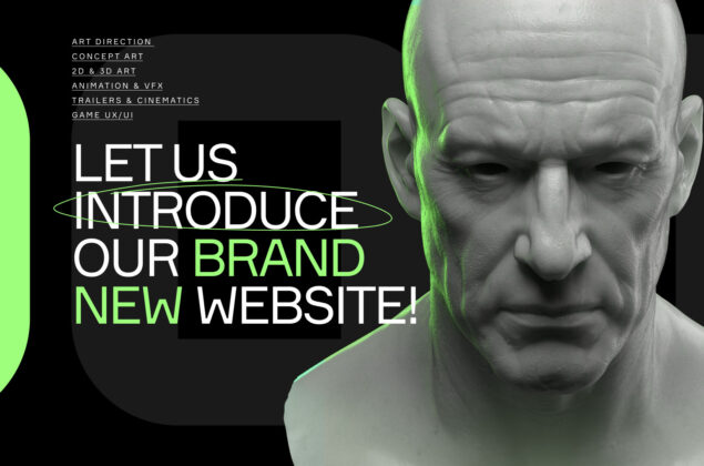
The team approached designing a website in line with those principles that they previously established while creating the design system. Those visual elements that are used as a part of the actual design are, in fact, the pieces of art from the real projects. Ultimately, one can get a first impression of the company’s work simply by navigating the website.

The addition of the third corporate color was initially suggested by snig.digital.
The 3D Studio’s team liked that idea so much that they made “wasabi” a part of their design system. It contributes nicely to the overall look and feel of the website and you can barely come across it in any portfolio artwork.
Yulia Snitko, the founder of snig.digital
Doodles and animated handwritten elements were another change that was brought by snig.digital. Despite the clean and spacy UI design, the team felt that the website could use some additional decoration elements. Used along with large and classic typography, they add a subtle yet complete feel to the overall website design.
Client-facing content
The marketing team of 3D Studio conducted preliminary research on their existing clients and discovered what clients are interested in the most when checking the service provider’s website. It appeared that information about services, key stakeholders, and portfolio is among the most needed types of content.
Providing easy access to service descriptions was the primary objective as far as UX design is concerned. The website’s navigation is structured in a way where a dropdown menu can be used either by clicking on a “services” tab on the top left and navigating to the relevant service on the main screen or using a menu button on the top right that brings a full-screen drop down elsewhere.
Most 3D Studio clients reach out with a specific project in mind. Naturally, they would like to see portfolio samples relevant to their objectives. The team decided that it could be a huge time saver if they structured all the company’s portfolio in a way to provide quick access to the related artworks.

The team organized the 3D Studios portfolio and split it into three major style categories: cartoon, stylized, and realistic. On the portfolio page, users can quickly select one of the three categories where they will be directed to the related work samples afterward.
Users can further refine their search by using filters, narrowing down their search according to service, platform, and design type (e.g., 2D, 3D). There are additional pre-established tags that can also assist in the search. But more importantly, users can also switch styles (for example, from “realistic” to “stylized”) in a matter of seconds without going back to the main portfolio page.


The team included information about the key people on the website’s page dedicated to the company. By clicking on any specific person, one can view some background information that highlights the credibility and expertise of every 3D Studios key person.
Employer brand
As a service provider, having a strong employer brand is a part of 3D Studios long-term sustainable business strategy. Therefore, it’s the marketing team’s responsibility to ensure that the company has the right means to facilitate hiring efforts where the website plays a vital role.
As the first point of contact for prospective candidates, the company’s website has to make the right first impression and contain relevant information to build rapport with job seekers. The employer brand team of 3D Studio shared the general vision for the career’s section, and Maikl with TWID took it from there.

Most of the 3D Studio’s job applicants play games themselves. And one of the first things that users would notice on the careers page is some popular games that 3D Studio contributed to, followed by the running line “creating games that your friends play.” These elements enforce the company’s authority and spark interest in what 3D Studio has to offer in terms of job opportunities.
Job openings can be filtered by locations, type of employment (remote, office), and the design department. All the necessary information is placed right in front of the eyes. But if this is not good enough, the 3D Studio’s prospective candidates can always sign up to get notified when a more relevant opening is available on the website.

But once someone is convinced enough to send the application, the 3D Studio offers a possibility to introduce yourself in a unique way. Apart from a standard CV and cover letter, a job seeker is welcome to draw something just for fun, and that drawing will also be attached to the application.
Nightmare mode
The team also felt they should fulfill another essential objective of making a new website – keeping users entertained. At the end of the day, 3D Studio hires many talented artists, so they wanted to make an “easter egg” for those who could appreciate all the tiny visual details.

After going through several ideas, the team eventually decided to go with one of the options suggested by snig.digital. Nightmare mode, once activated, unleashes scary and haunting imagery. This feature adds many green and handwritten elements, adding more to the website experience and user’s impression.
What’s next for 3D Studio?
The project is completed, and the brand-new 3D Studio website finally goes live. It took dedication and hard work of more than ten people to get to this point. 3D Studio is beyond grateful to the marketing team, TWID Creative Studio, snig.digital, and everyone involved in making this project possible. The new website turned out to be very special, so the team decided to apply for Awwwards – the platform that recognizes the talent and effort of the best web designers and developers.


